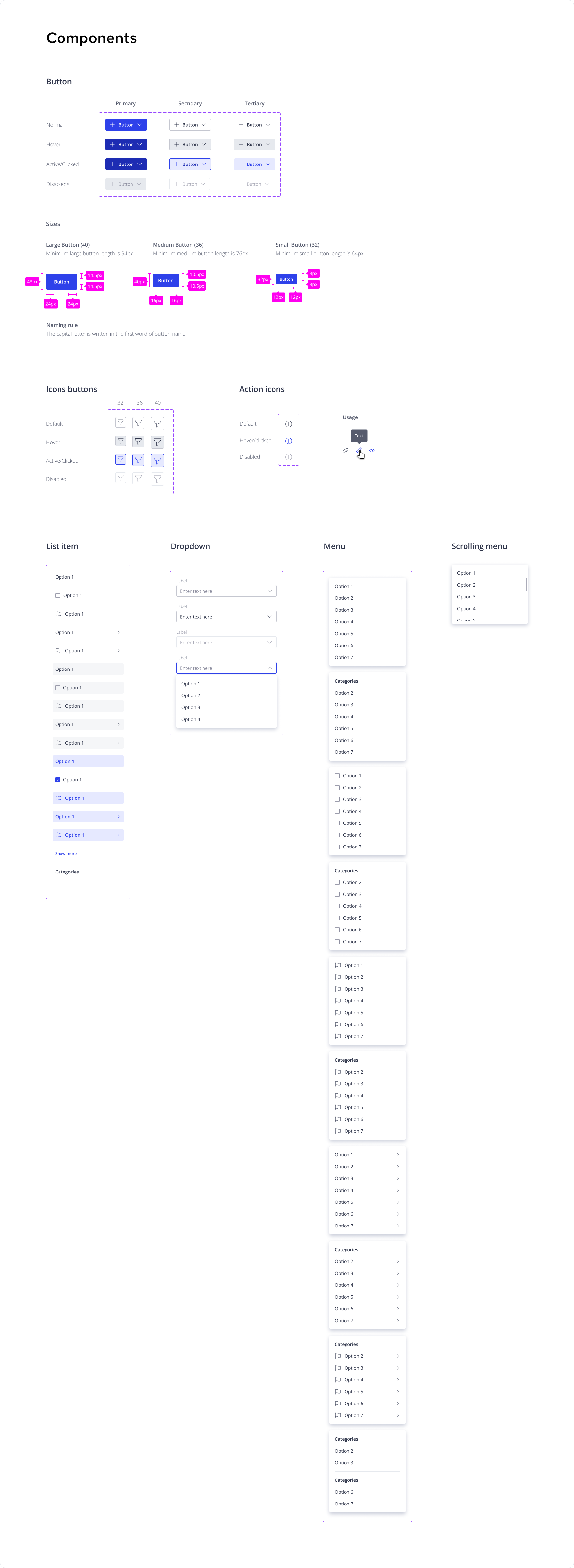
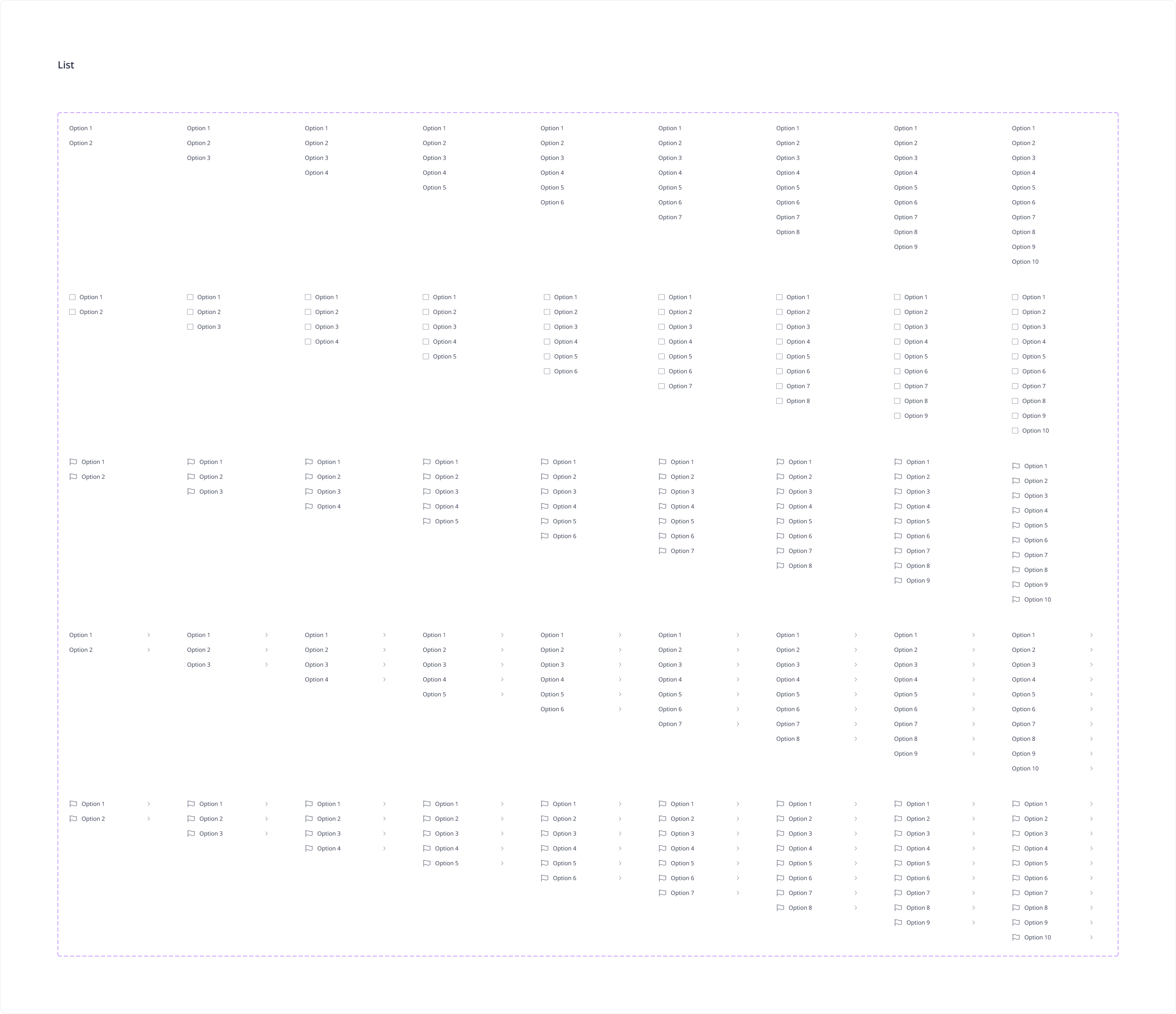
For 10 months, I was the only Product Designer at the firm, and I should have all the instruments to solve requests quickly. The platform had gone through a change in business model but hadn’t been updated and systematized. After my deep acquaintance with the available materials, which were created over seven years by my colleagues, three designers who, during this time, changed one another, I concluded that the platform doesn’t have a stable design system; therefore, my goal was more complicate, but I knew that would be worth that in future.
First of all, I looked at the general concept of the platform. Time went on, and the current concept looked not fresh. After research, I decided my first goal would be to define and update style guides, and the second is to set up a comprehensive set of components in Figma. The firm didn’t have plans to change the platform concept completely or at least start with changing one of the system’s parts completely, so I tried to insert changes that would look natural with the existing platform. I started to create my instruments: collecting all colors, shapes, and fonts from the current platform. I reduced unnecessary ones and added additional ones that were urgent.
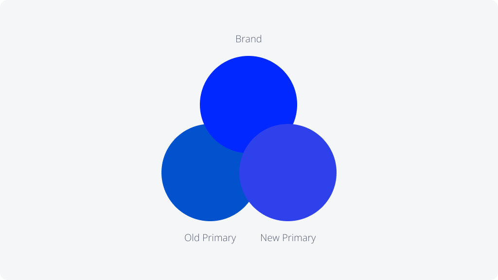
One of the first decisions was to update the main color of the platform, but not radically, only its shade. The main color of the platform was faded, old fashioned, and in addition, very different from the corporate marketing color, so when I decided to change it, I pursued two goals: – Color should revitalize the platform and become more modern and competitive. – The color should become closer to the marketing color (it does not have to become identical)
After that, I added grey colors that will work with the new prime color and will present the platform more freshly.
After that, I added grey colors that will work with the new prime color and will present the platform more freshly.
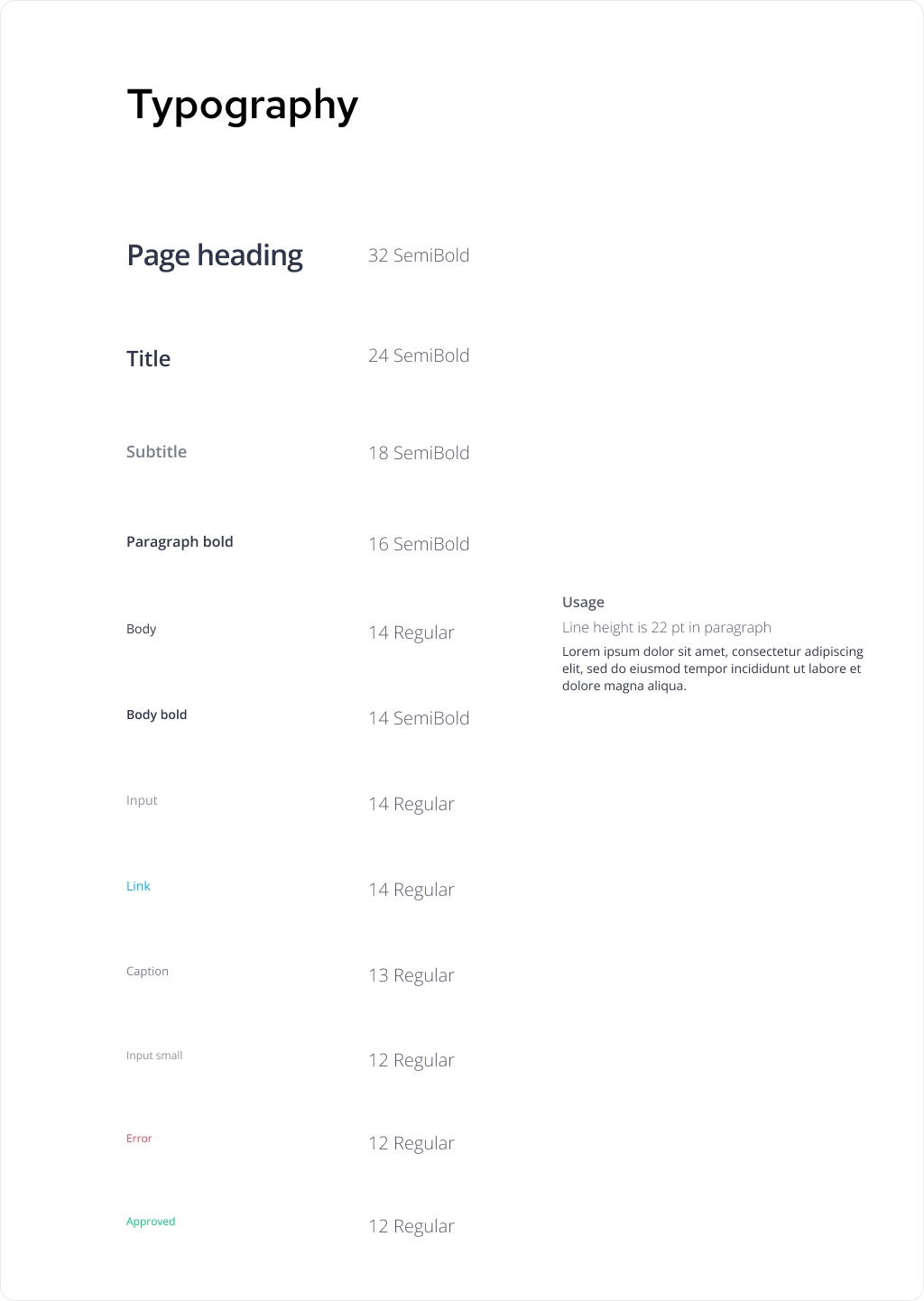
I aligned all typography styles.
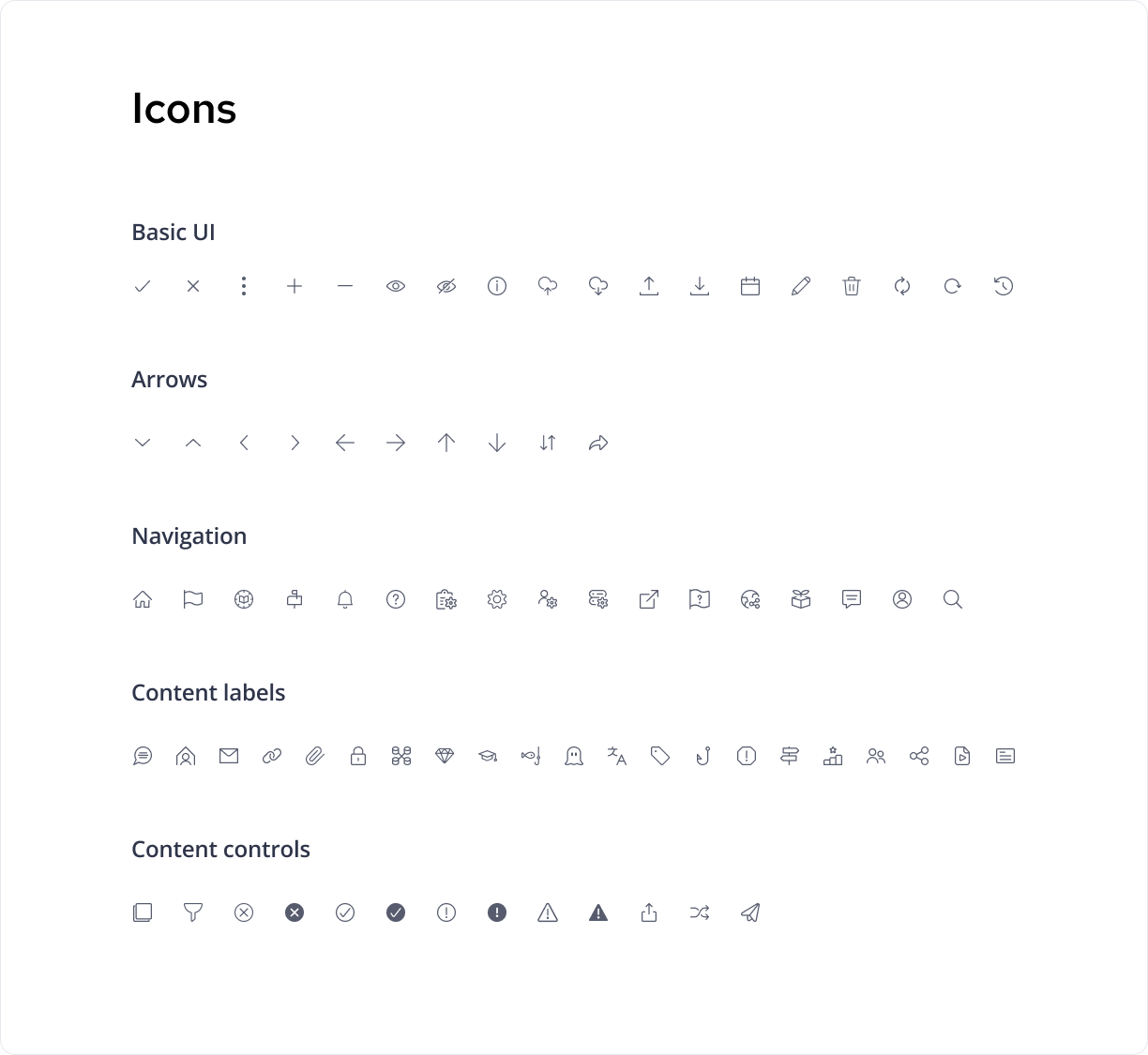
Also, I decided to align the style and sizes of all icons and started using the Streamline icon library. Sometimes it was necessary to combine icons or create a completely new icon, which I did by using Figma App. https://www.streamlinehq.com/icons/streamline-regular
I believe the company will grow one day, and we will have the opportunity to use all my changes wider and refresh more areas in the platform. Meanwhile, I started preparing and implementing new changes during current tasks. To my joy, customers began to note the changes quickly and started giving positive feedback at meetings that were not connected to those changes.
Nowadays, users are experienced and more demanding of the design aspect. More of that, those who use some platforms on a daily base immediately pay attention to changes. To my joy, our customers started quickly noticing the changes and giving positive feedback at meetings unrelated to the design topic.
I should have a strong strategy to combine my design plan and continue with mutual work; in other words, remain a stable part of the chain process. I created a plan for what I would do and presented it to the Product and R&D teams. My vision was approved, and the Design System topic was entered into the company’s roadmap. Behind daily work on Jira tickets, I started deploying new styles and components into the platform. After a period, the R&D team started to build the Stoy book with the components.
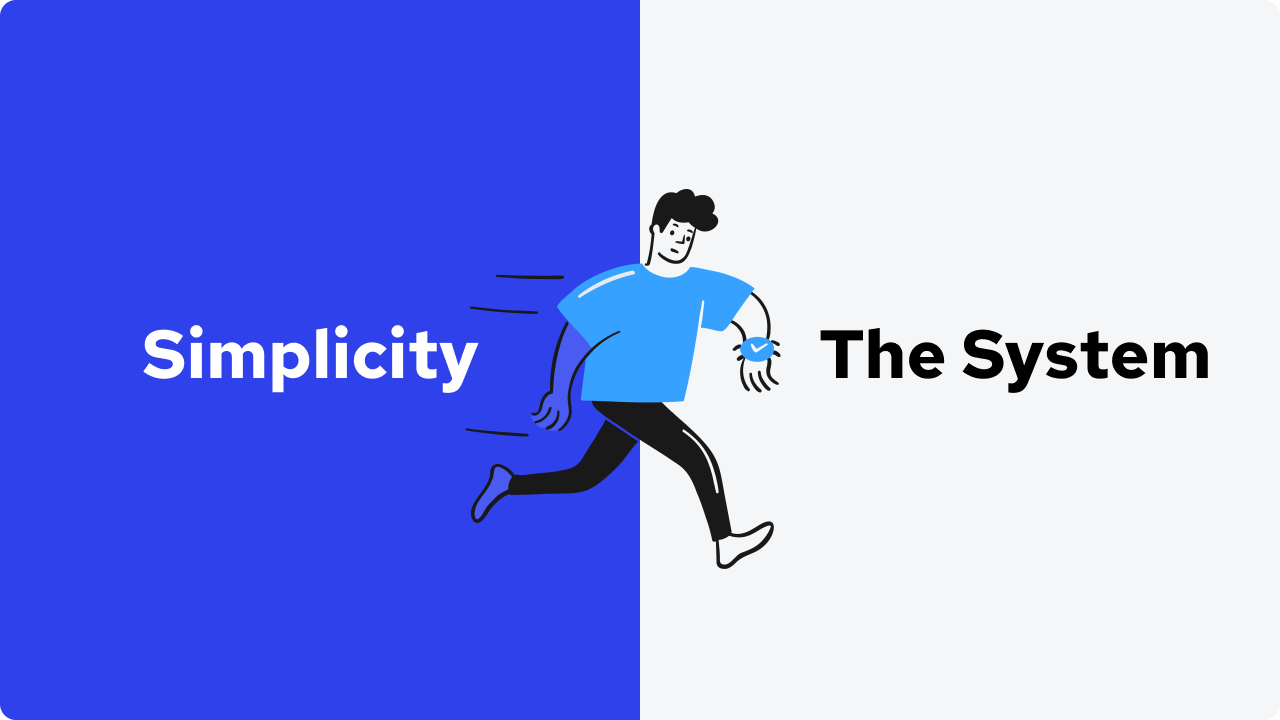
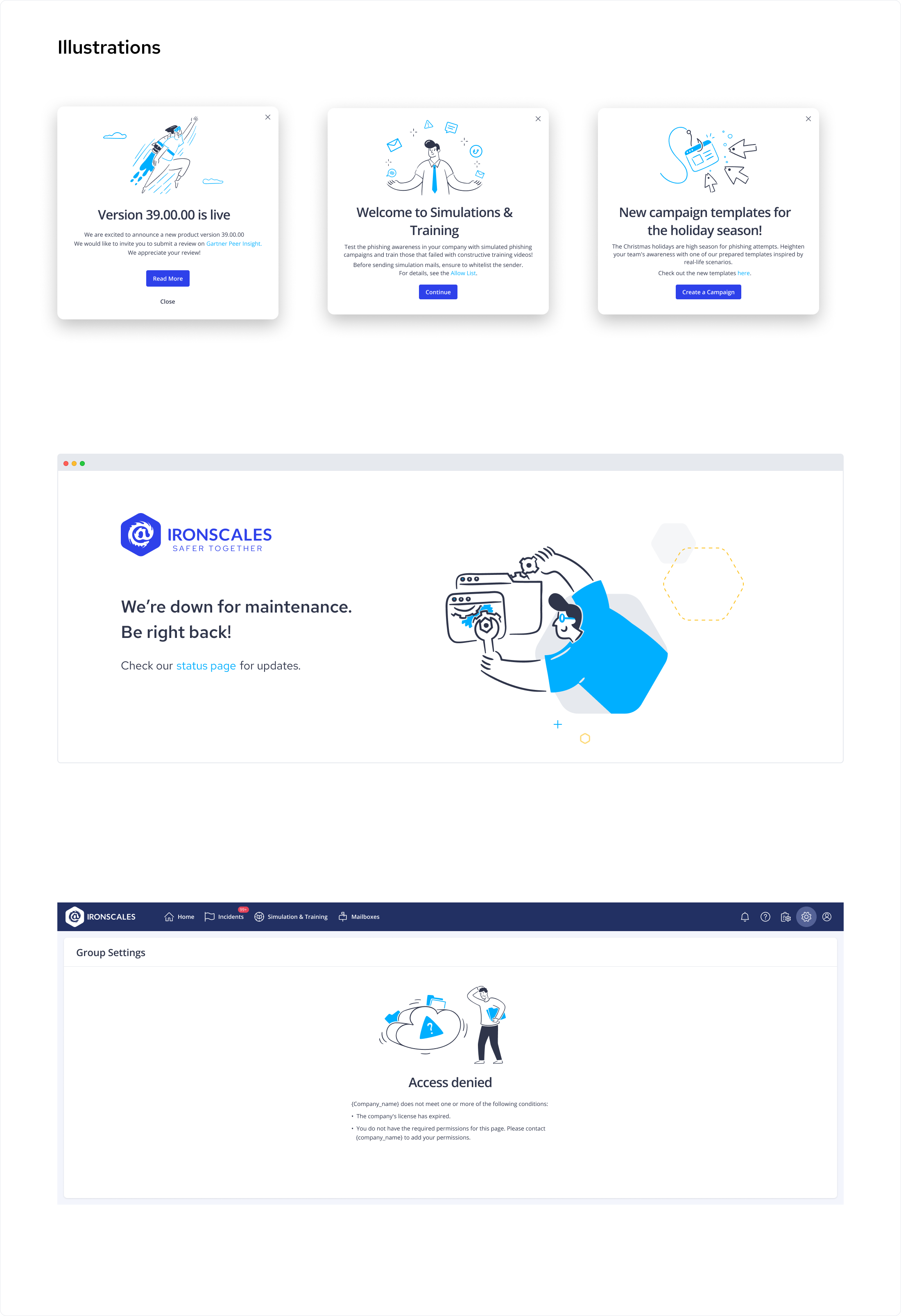
An Image is a fast way to pay users attention and it gives the platform more engagement, therefore I started to implement illustrations that weren’t on the platform until now.
In addition, I started to use illustrations that weren’t on the platform until now. I have chosen a big vector library for fast and flexible use. Also, I could always mix, add, or change any illustration for my needs. Of course, I changed the main color of the illustration to one of our brand colors. https://www.streamlinehq.com/illustrations/illustrations-brooklyn

